|
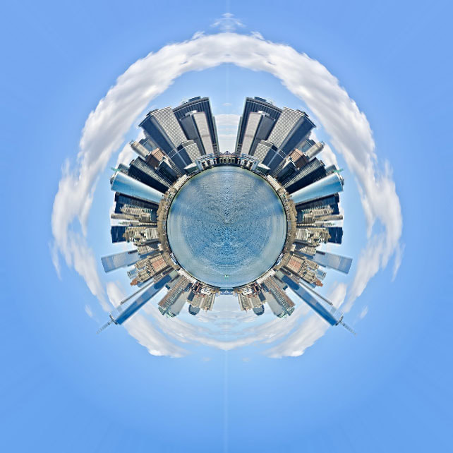
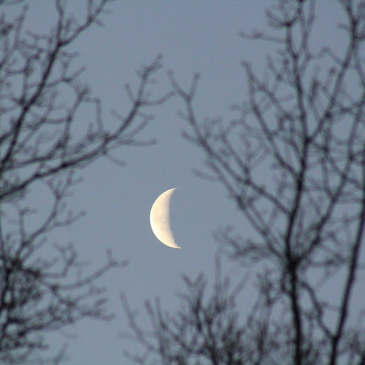
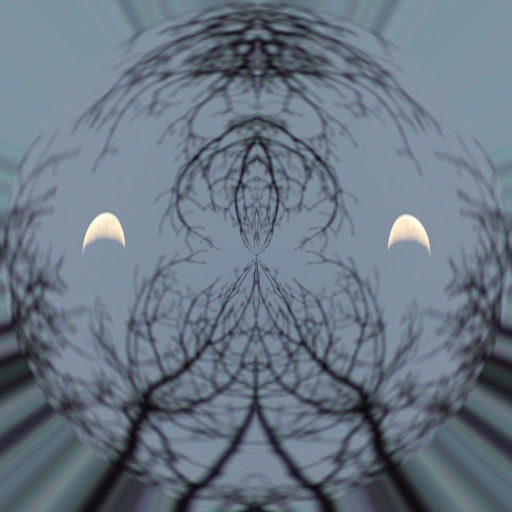
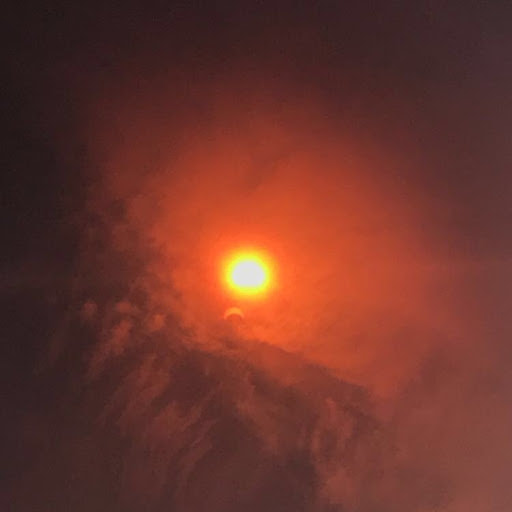
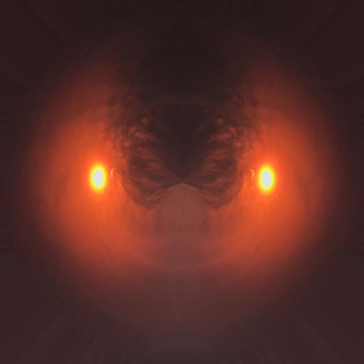
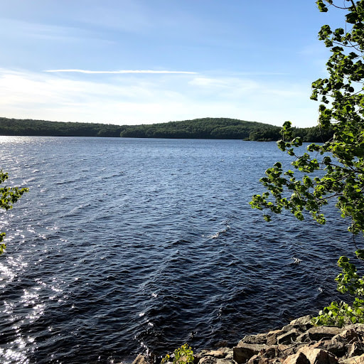
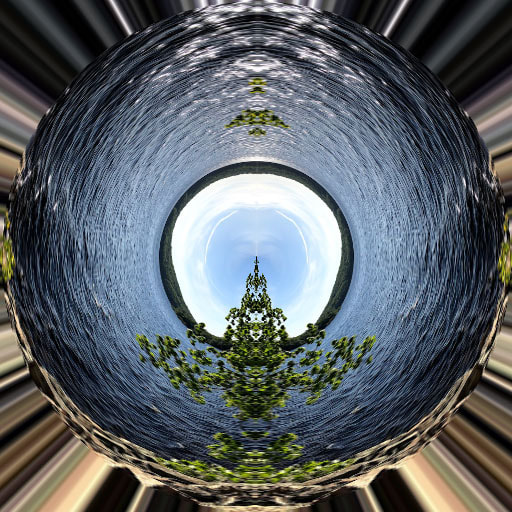
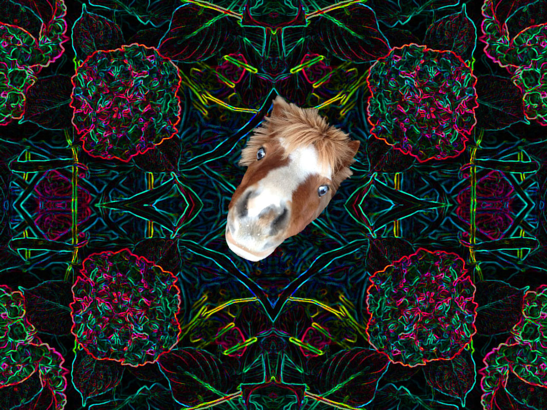
For this unit we did the mini city. The first image I have is off of the internet because I didn't have a landscape image of the city. we used photoshop to crop the image 200% larger and duplicated they layers to create to halves to the image. We combined all thew layers into one and used the polar coordinates distort feature to get the circle in the middle. For my next image I chose a picture of the moon from my own images. I thought it would be cool to capture the moon in the sky but it ended up turning out kind of like a face with eyes. then I used a photo I took during a solar eclipse through a piece of glass covered in soot. I thought the colors, clouds, and shape of the eclipse would make for an interesting abstract image. Finally I used a photo the I took at Diamond Reservoir for my last photo. I though the image would have a lot of texture and things to look at because of the hills, water, and sky. It almost looks like a portal.
For double, we got the chance to go to Tangerini's to redo the elements and principals unit. We recreated the top photographer challenge and competed for a pair of light up water speakers. For this challenge, I got roughly 40 pictures and narrowed it down to my top 12 and, finally, down to my top 9. I chose these images because I felt they really captured the essence of Tangerini's. There was no criteria for our photos other than to use the elements and principals, but I felt choosing images that represented Tangerini's would allow for better pictures than if I chose ones based strictly off of the elements and principals. I really liked the way all of these images complimented each other and I love the mix of colors in each image. My favorite image is either the bottom middle or the top middle. The bottom middle image has so much going on yet looks very simplistic. I used the rows of plants to accent the blurred goat in back create a feel of depth. I thought this would be a great image because of the row of green plants, then the red, and then green again before drawing your attention to the goat. I also loved the top middle image because of how unusual it is. The blur is in back but also up front. The flower closest to the camera is blurred as well as the background, creating a clear image of the flowers sandwiched between the foreground and background. It's unusual but eye catching. I also edited a few of the photos in Photoshop to bring out the colors and emphasize the nature of Tangerini's Farm. It was also very cool to win the speakers!!
For this double, we were challenged to find as many faces in every day objects as possible. We got a chance to use little fake eyes and a chance to find faces without the fake eyes. All of the faces were made or found around the school. My favorite face with the eyes is the guy playing chess because its a very subtle change but enough to have to make you look at it twice and think something isn't right. My favorite face without the eyes is definitely the plug because because it looks so shocked. I think we would have had better opportunities or more faces to find if we were to do the assignment outside of school only because all the students are finding the same or similar faces. I think using the eyes makes the pictures look a lot better because there's some part of realism (the eyes) but its also made up of other completely random objects which helps keep it interesting. I enjoyed this assignment a lot because it was fun to walk around and find hidden faces in objects you'd least expect.
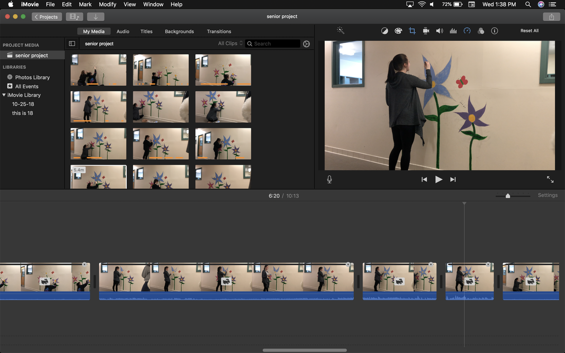
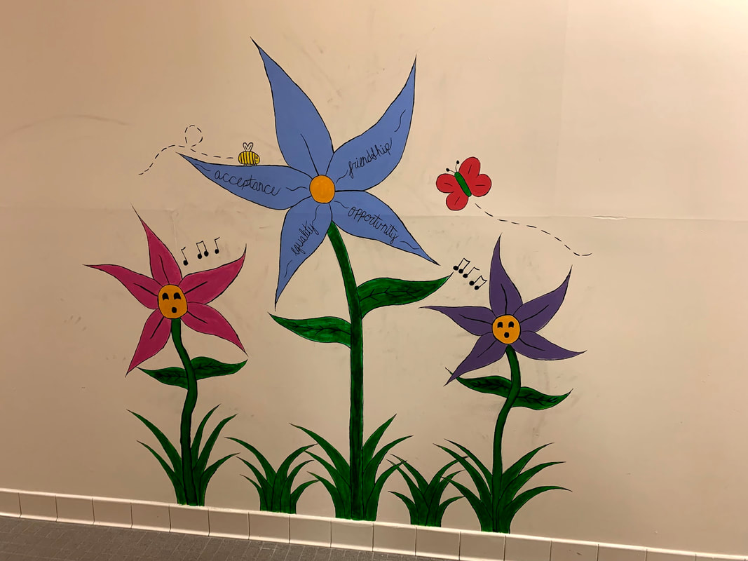
For the past two to three weeks, I have been working on my senior project! for my senior project, I chose to create a mural for the girls locker room. I chose to do this as a project because a lot of my junior and senior year were spent in the girls locker room because of the classes I took and it was difficult to not notice how dull and drab the space was. I knew I wanted to bring something light and fun to the space to change the aura but I knew it would take lots of time to research and do it right. It was really an awesome experience to be able to invest time and energy into a piece of work that so many students told me they appreciated! it was really an eyeopening experience and I feel I got the chance to really understand myself as an artist. After working on this project, I can honestly say I hope I have more opportunities in the future to create more murals and challenge my art skills more often! So far, all I have left is the time lapse video to finish editing and to finish my final paper.
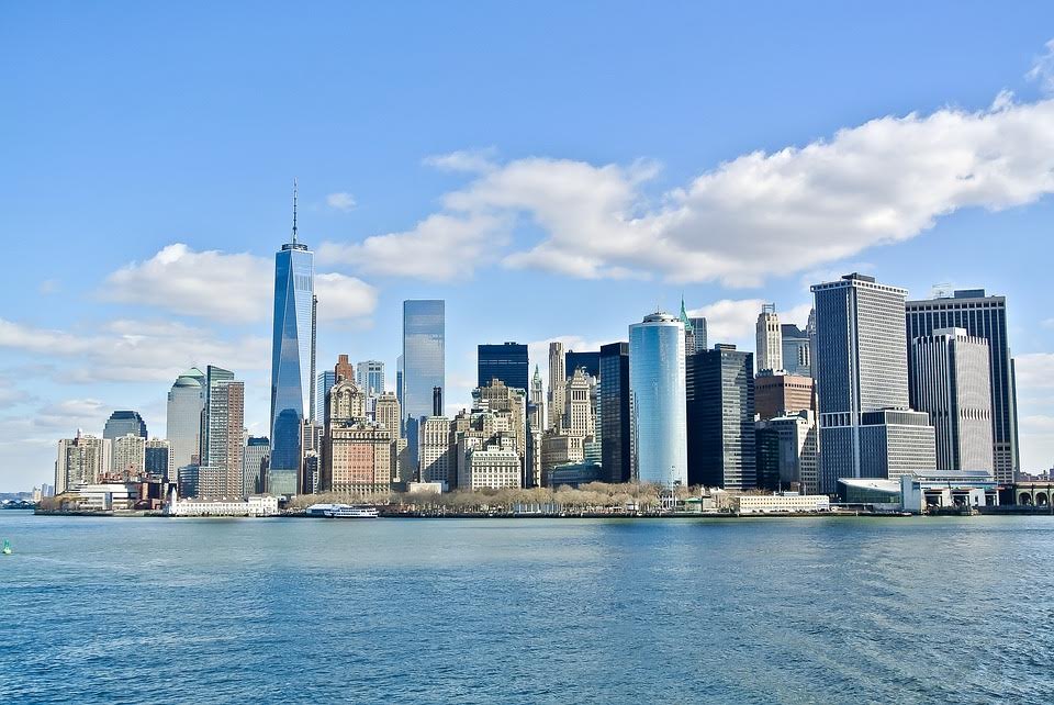
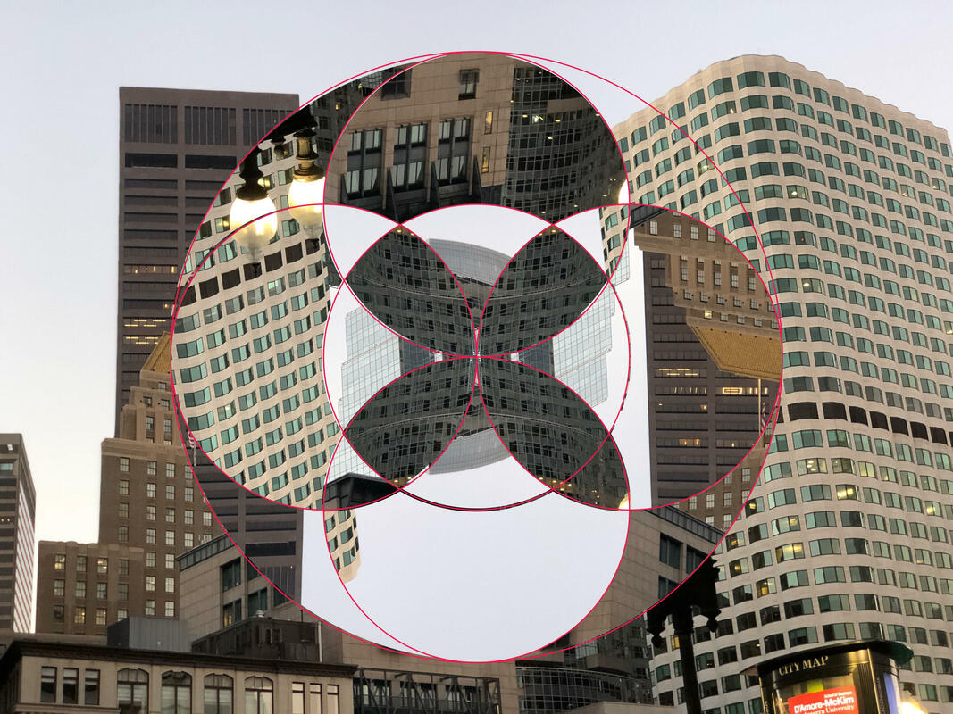
For this unit, we did photo collages in Illustrator and Photoshop. First we had to get our stencil outline in Illustrator. Then we had to import our image into photoshop, copy and paste our stencil as a smart object, and resize it without distorting the aspect ratio. We used the magic wand tool in this until and the regular move tool as well. To get different pieces in different spots on the stencil, you use the magic wand tool on the smart objects layer and select your desired section. Then you go to the background layer, switch to the move tool, and copy and paste to create a new layer with that section. You can flip the pieces vertically or horizontally to change the visual. The first photo I have is a photo I took in Boston right outside of South Station. The second image I got online because I thought it would be a very interesting visual to basically flip the focus of the image without completely "botching" the whole image. I thought the picture I took in Boston would be a great photo for this project because of the different textures on all the buildings. The one thing I struggled with most during this unit was keeping track of all the new layers made. If I had to find one specific piece of the stencil, I'd have to cycle through 40 different layers until I found the one I was looking for. Overall I had fun with this project even though it felt just a little repetitive in the actions to create it.
For this unit we worked with light modulation and shadows. First, we opened up the Adobe Illustrator file to get our template. We used the pen tool to create our designs to cut out. after printing our work, we used xacto knives to cut out our designs and we folded along the edges so we could see the designs at a 90 degree angle. then we used light to observe the obscure shadows. I think this project was very interesting. I had a set idea in mind that I was going for but once I started with the light, I realized my design looked way different than I thought Although it's not what I anticipated I was still very happy with my results, especially with my lantern standing straight up. I think the shadows look very unique and intricate. If I were to do something different, I would choose to do a lot less curved lines. The curved lines were very hard to cut especially with a stiff blade. The curves came out a bit choppy but overall not too bad for trying for the first time!
 The two weeks for Pixar in a box has come to an end! I chose to put my Senior Project mural design into Photoshop to get a better idea for how the final product would look. This took the full two weeks, unfortunately, and I was really looking forward to trying out some food doodles but putting my time into this project was a much better idea, since I had the availability to work with my teacher and mentor. I explained in my last post how I got the text and how I colored it in but one thing that I found most difficult about this project was just trying to get everything the way I wanted it to look. It was difficult to line everything up, make sure I was coloring on the right layer, making sure I had the font downloaded before I opened the Photoshop document, and more. I didn't get the chance to find a brush pattern for the background, but I'm still unsure of how I want that to look, so accomplishing the outline for the main focus was most important. I also had a very difficult time with understanding all the functions for this specific project, however I feel like I definitely learned a lot from this. I had a really good time working on this project and I feel a lot more confident in the outcome of my mural and photoshop skills. It was cool to work more closely with Photoshop and navigate through it on my own.
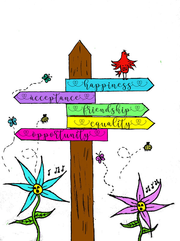
During the two week period we had for pixar in a box, I chose to do a different, independent project. My intention was to do 2 projects, however time prevented that. My goal was to create my first sketch for my Senior Project using photoshop and create food doodles. Due to time and many problems, I was only able to focus on my Senior Project animation. I chose to create my first mural design on photoshop because I knew I would be able to produce the results I'd want using this application. To do this, first I had to get a picture of my first pencil sketch. From there, we imported the photo to photoshop. I changed the threshold on the photo so the lines would appear black, similar to a coloring page. Then, I created a second layer, the one that would be colored on. After coloring, I needed to get a font from Dafont.com for the words on the signs. I ran into a few problems, the first being I spent a whole class period trying to figure out how to get different brush shapes, specifically one that looked like grass. After finally figuring it out, photoshop would not let me use the brush. The second problem I ran into was the font. Because the lab computers don't save any files after logging out, each time I reopen the document on the lab computers it will give me warnings about the font. The last problem I ran into was with the image. After completing almost all of it, I discovered that certain things didn't look good or they weren't proportionate. for that, we had to make copies of the first and second layers, resize and erase all the extra parts that I wouldn't need and then go back to the original layers to erase the parts that weren't needed. Overall, I'm very content with what I've accomplished and I'm thankful I was able to take the time to work on this.
|
AuthorMy name is Emily and I love to photograph animals and nature! Archives
May 2019
Categories |
 RSS Feed
