 The two weeks for Pixar in a box has come to an end! I chose to put my Senior Project mural design into Photoshop to get a better idea for how the final product would look. This took the full two weeks, unfortunately, and I was really looking forward to trying out some food doodles but putting my time into this project was a much better idea, since I had the availability to work with my teacher and mentor. I explained in my last post how I got the text and how I colored it in but one thing that I found most difficult about this project was just trying to get everything the way I wanted it to look. It was difficult to line everything up, make sure I was coloring on the right layer, making sure I had the font downloaded before I opened the Photoshop document, and more. I didn't get the chance to find a brush pattern for the background, but I'm still unsure of how I want that to look, so accomplishing the outline for the main focus was most important. I also had a very difficult time with understanding all the functions for this specific project, however I feel like I definitely learned a lot from this. I had a really good time working on this project and I feel a lot more confident in the outcome of my mural and photoshop skills. It was cool to work more closely with Photoshop and navigate through it on my own.
2 Comments
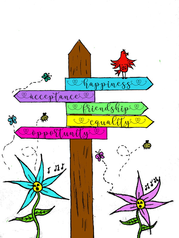
During the two week period we had for pixar in a box, I chose to do a different, independent project. My intention was to do 2 projects, however time prevented that. My goal was to create my first sketch for my Senior Project using photoshop and create food doodles. Due to time and many problems, I was only able to focus on my Senior Project animation. I chose to create my first mural design on photoshop because I knew I would be able to produce the results I'd want using this application. To do this, first I had to get a picture of my first pencil sketch. From there, we imported the photo to photoshop. I changed the threshold on the photo so the lines would appear black, similar to a coloring page. Then, I created a second layer, the one that would be colored on. After coloring, I needed to get a font from Dafont.com for the words on the signs. I ran into a few problems, the first being I spent a whole class period trying to figure out how to get different brush shapes, specifically one that looked like grass. After finally figuring it out, photoshop would not let me use the brush. The second problem I ran into was the font. Because the lab computers don't save any files after logging out, each time I reopen the document on the lab computers it will give me warnings about the font. The last problem I ran into was with the image. After completing almost all of it, I discovered that certain things didn't look good or they weren't proportionate. for that, we had to make copies of the first and second layers, resize and erase all the extra parts that I wouldn't need and then go back to the original layers to erase the parts that weren't needed. Overall, I'm very content with what I've accomplished and I'm thankful I was able to take the time to work on this.
|
AuthorMy name is Emily and I love to photograph animals and nature! Archives
May 2019
Categories |
 RSS Feed
